Kaggle rank patterns - beating the benchmark
Recently, I have been spending what little free time I have working on a couple of fun Kaggle competitions: the “getting started” Titanic: Machine Learning from Disaster competition, as well as an actual prize-eligible contest, the Accelerometer Biometric Competition.
Kaggle’s done a brilliant job at making machine learning truly feel like a sport. Not only that, but having played around with some basic techniques has helped give solid context to many of the ideas coming up in school.
When I looked at my position on the leaderboard for ABC, I wanted to know how steep a climb it would be to move a little higher up the charts. So naturally I scraped the leaderboard data and loaded it into R.
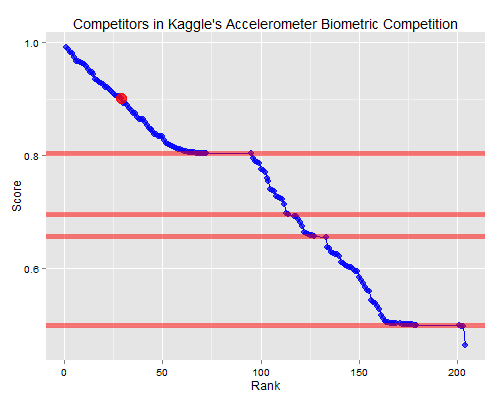
What I found was actually very surprising:

Perhaps egocentrically, I put my own team as a big red dot on the chart. The horizontal red lines represent the scores achieved from publicly-shared “beat the benchmark” code from the forums. The gaps in the plot show where many people have submitted those benchmarks unedited and then failed to improve upon it, ie. ties.
The “hockey stick” shaped formations between these ties is pretty striking, especially in the top 75 competitors. While incremental improvements over the benchmark code show up as an asymptotic portion of the curves on the low-end, once competitors break out of that zone, you see an amazing linear pattern heading upwards in the rankings.
I would have expected another asymptote right at the top as people pushed against what is possible to learn from the data. But as of right now, it is still linear right up to the best teams, indicating they are still finding more information as they approach the perfect score.
It wouldn’t be a post about Kaggle without a prediction, right? As the competition deadline approaches, I suspect this pattern will break, at least in the top hockey stick where there’s almost no more room left to improve. I anticipate new asymptote up against full classification in the end. Hopefully my team’s big red dot heads upwards too!
I’ll update you in a couple of months.


Leave a Comment